FireMon Product Suite
A visual design refresh to enhance the user experience, prioritize accessibility standards, and establish comprehensive guidelines for future product development and enhancements.

Project Overview
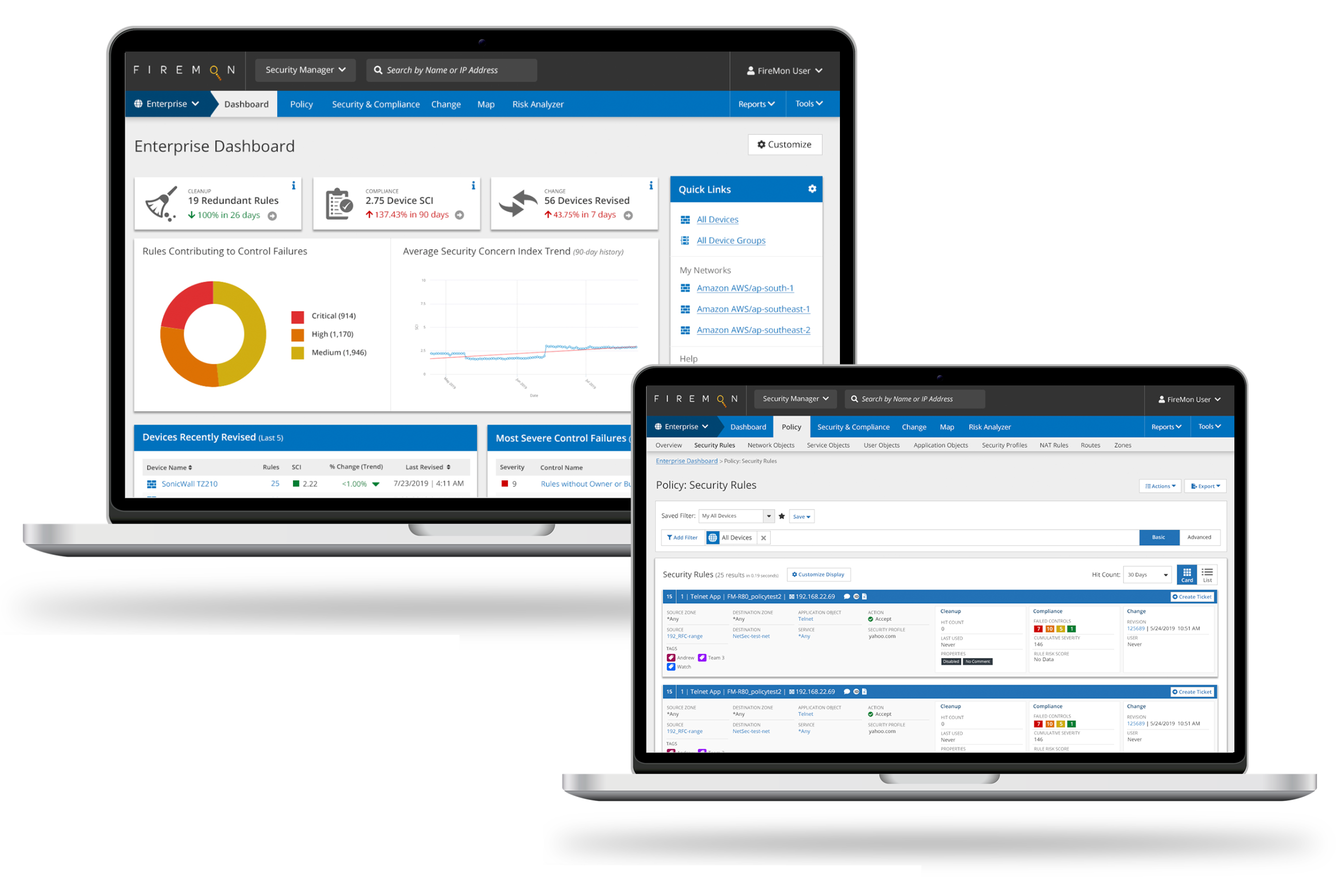
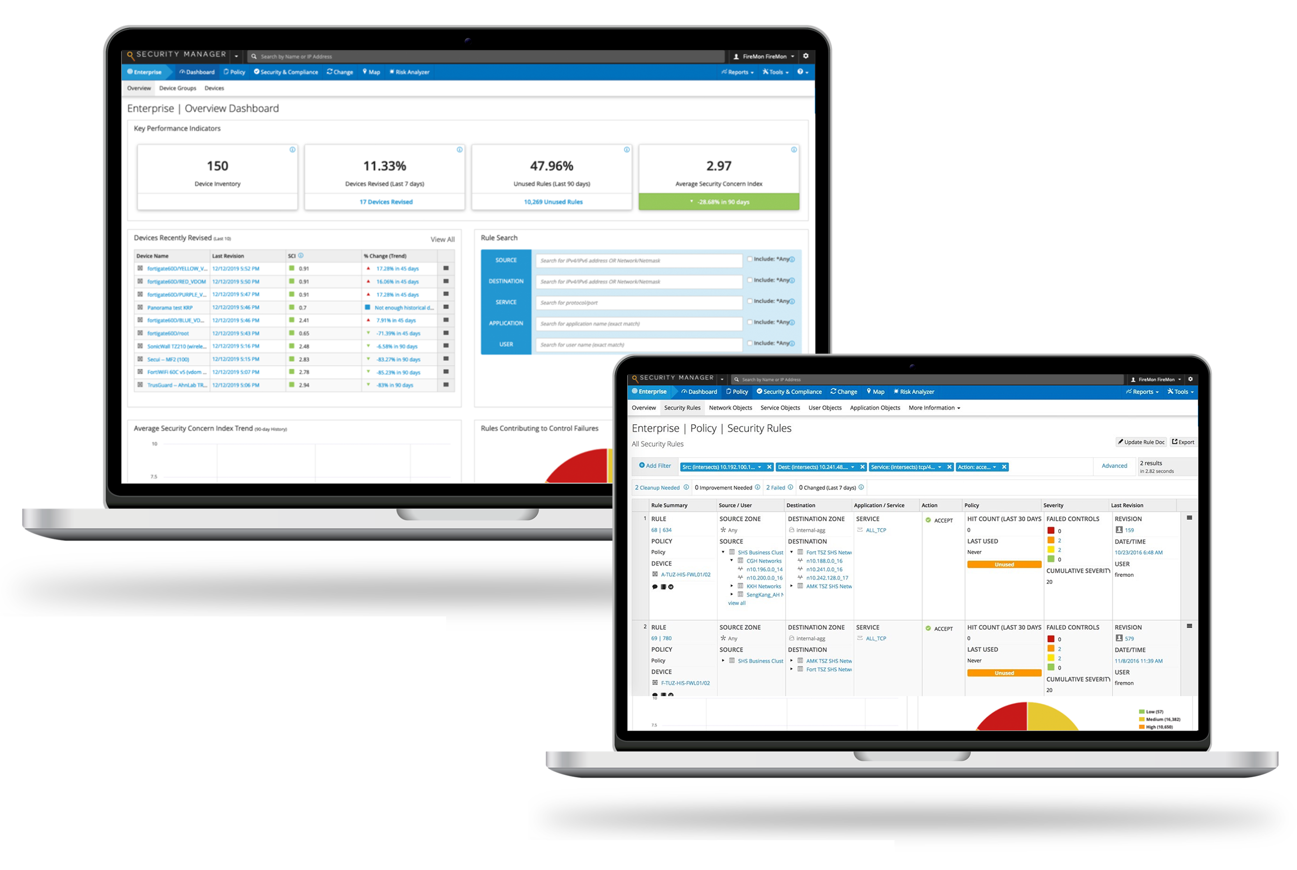
As a leader in the network security space, the FireMon SaaS-based product suite provides businesses with complete visibility and control across their entire IT landscape to automate policy changes, compliance, and minimize policy-related risk. One simple misconfiguration could lead to devastating consequences and it was impertinent that the new visual design provided the following.
- Emphasized main tasks and critical data
- Included an accessible color palette (E.g. color contrast & color-blindness)
- Allowed the user to easily scan and parse visualizations and reports
- Established a visual hierarchy to effectively direct users towards key focal points
Understanding the Current Product
Recognizing the importance of a design audit in order to lay the groundwork for a successful visual design refresh, I collaborated with cross-functional teams—including QE and sales—while closely partnering with product owners and the VP of technology to comprehensively grasp the intricacies of our product suite. This allowed me to come up with a strategic visual design approach that would enhance usability, coherence, and alignment with both user expectations and brand objectives.
Identifying Pain Points
Strategically focusing on key elements of the visual design by pinpointing areas of user dissatisfaction to guide improvements.
Design Inconsistencies
Identifying and addressing inconsistencies, such as styles, colors, and typography, to ensure a more cohesive and polished visual appearance.

Highlighting Successful Elements
Identifying elements that were effective and well-received by users to retain and enhance during the refresh.

Understanding User Needs
Understanding user preferences, behaviors, and pain points to use visual design to better meet user needs and expectations.
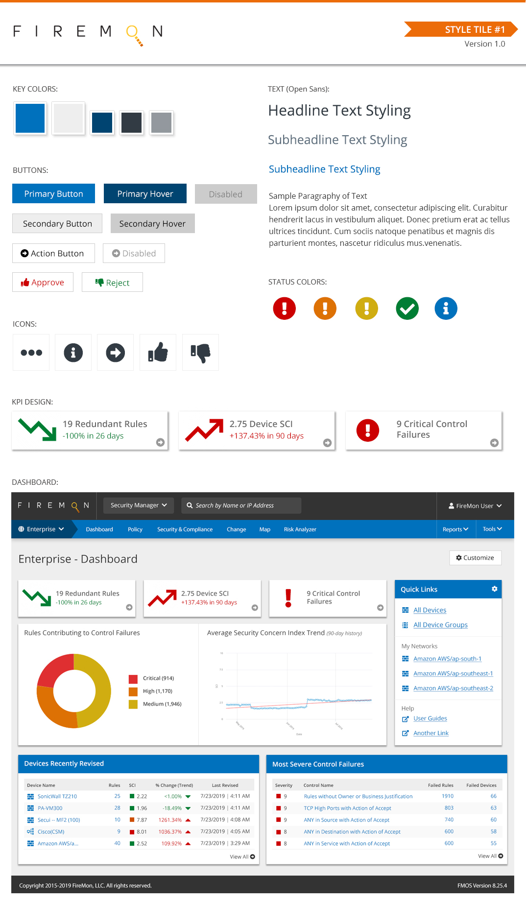
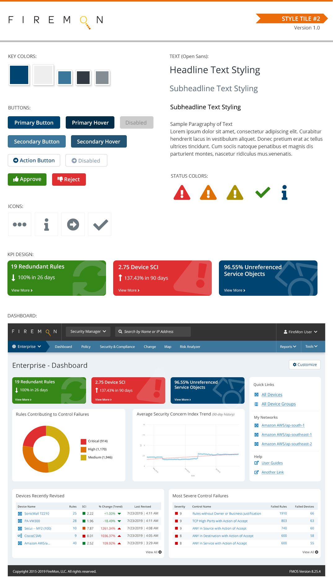
Accessibility
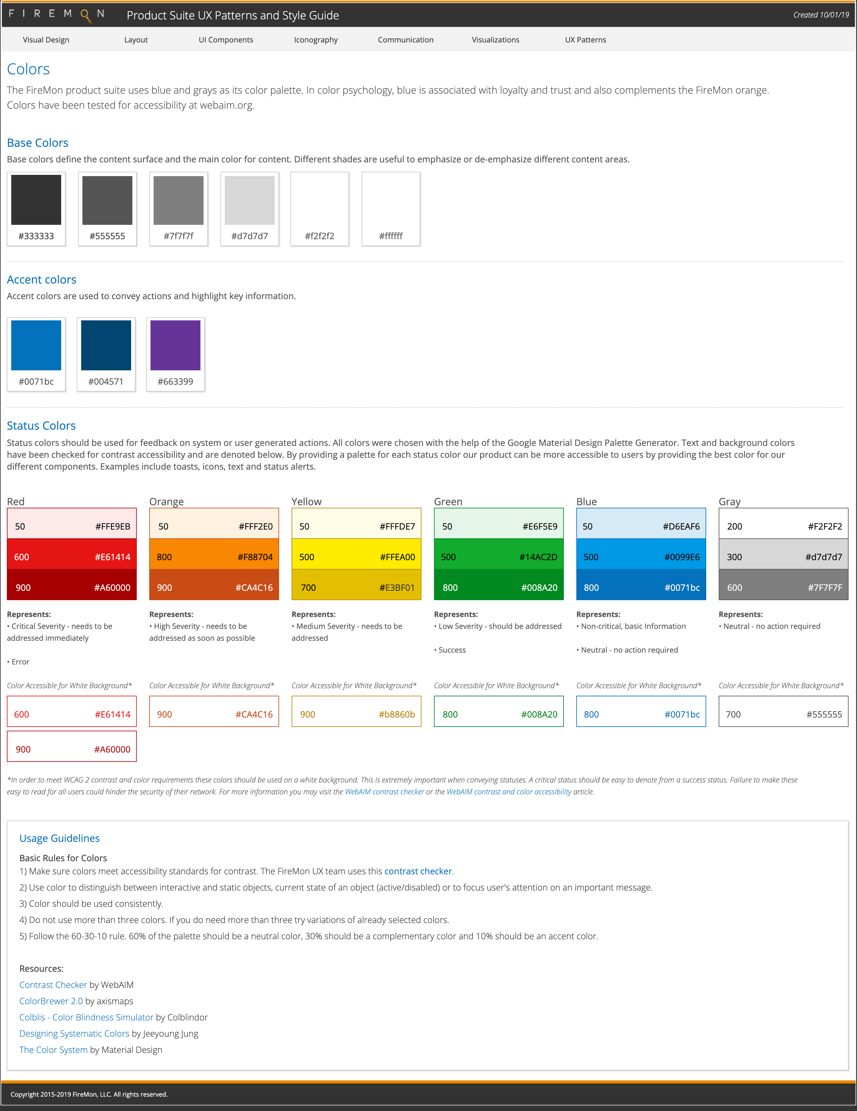
On a typical day, network security engineers scan thru millions of lines of data in order to identify risks, misconfigurations or violations. One simple misconfiguration or miss could lead to devastating consequences and it was critical that the color palette was accessible, easy to scan, parse and understand. I spent many hours researching and refining the status color palette to ensure the following.
- Colors aligned with the user’s mental model (E.g. homeland security advisory system)
- Met accessibility standards for color contrast (Level AA)
- Red and green were distinguishable for users with Deuteranomaly, the most common form of color blindness
- Allow for variations in color to allow for scalability in the UI
Before & After
Use slider to view UI with new visual design applied.
<< Old Design
New Design >>