NHA Professional Membership

A portal redesign that reimagined the way healthcare professionals stayed certified by offering users an upsell to an affordable membership that solved user pain points.

Because of the high visibility and scope of this project, I embraced the roles of both design project manager and senior product designer.
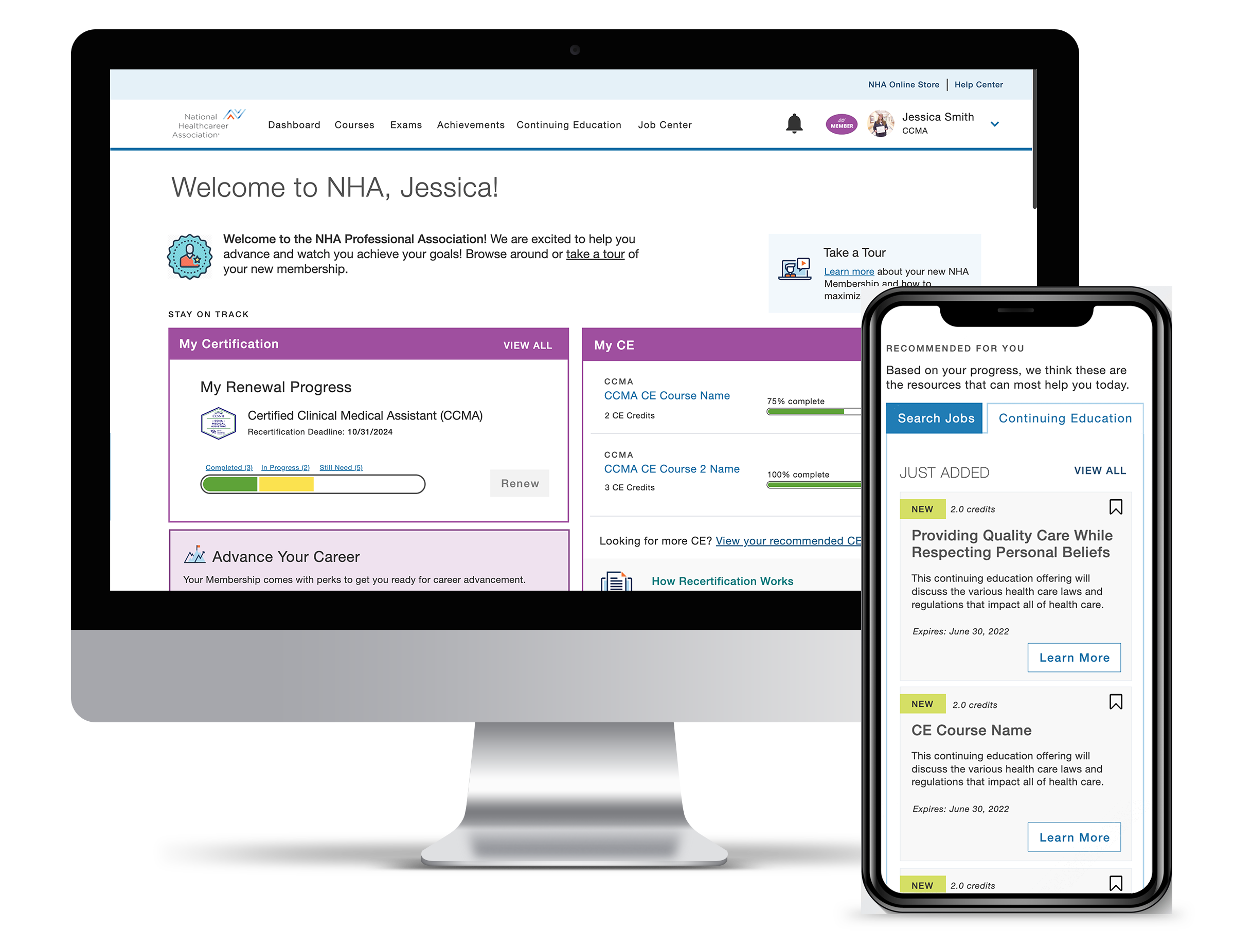
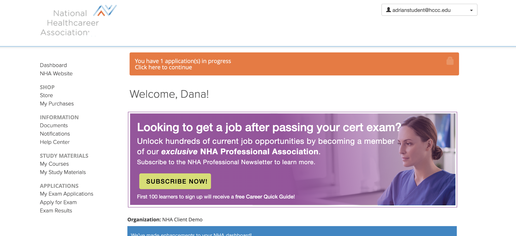
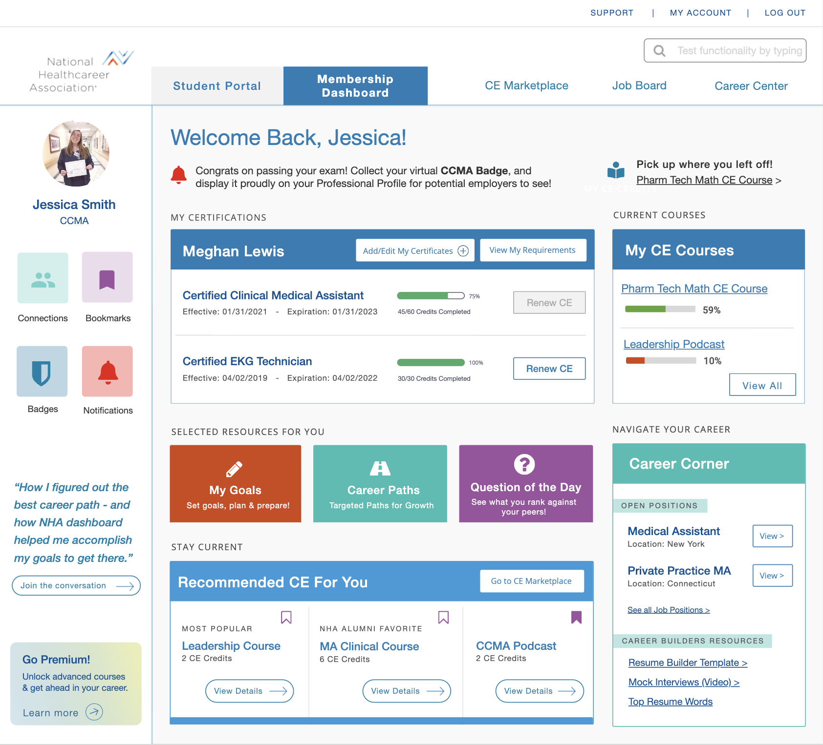
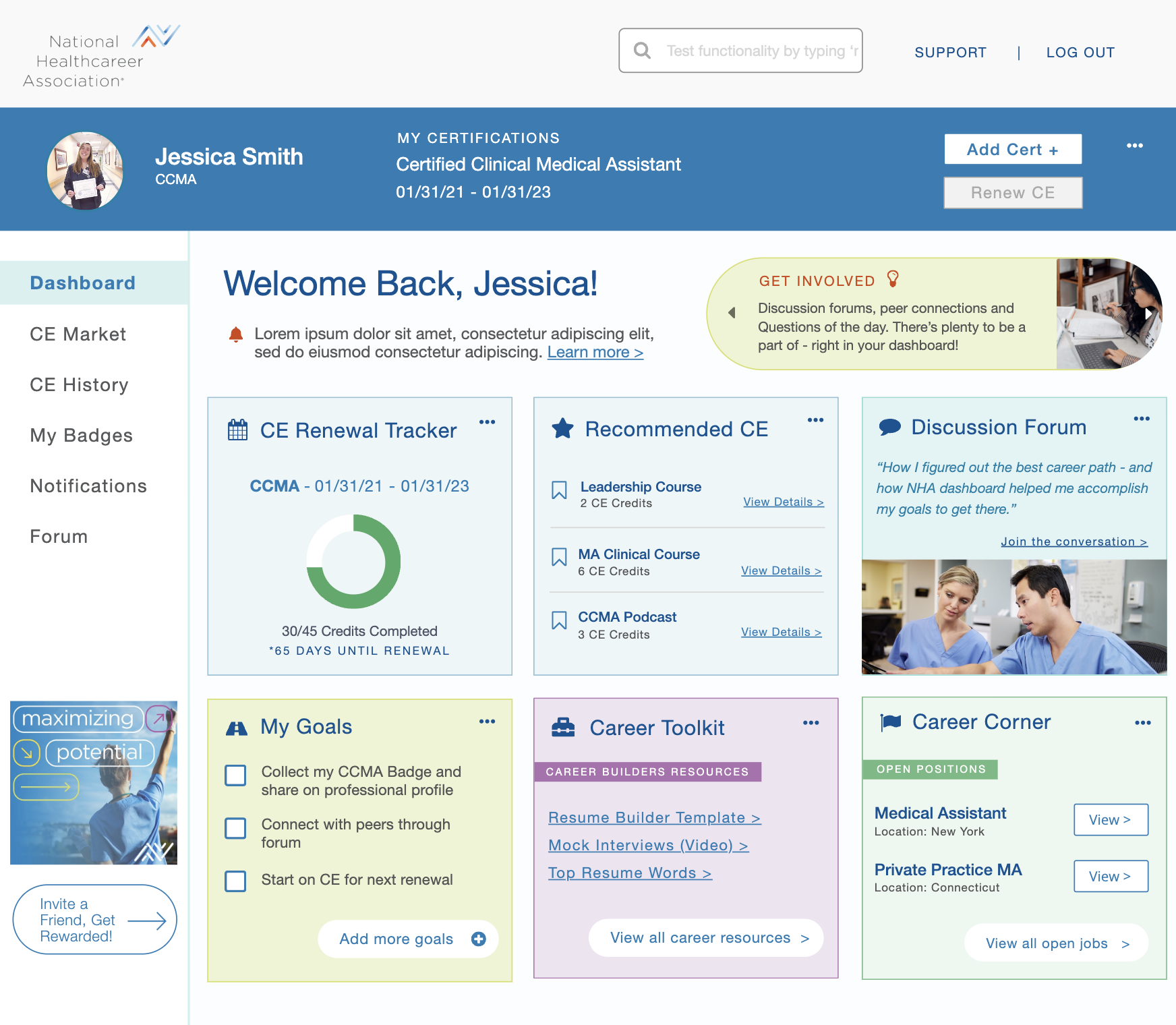
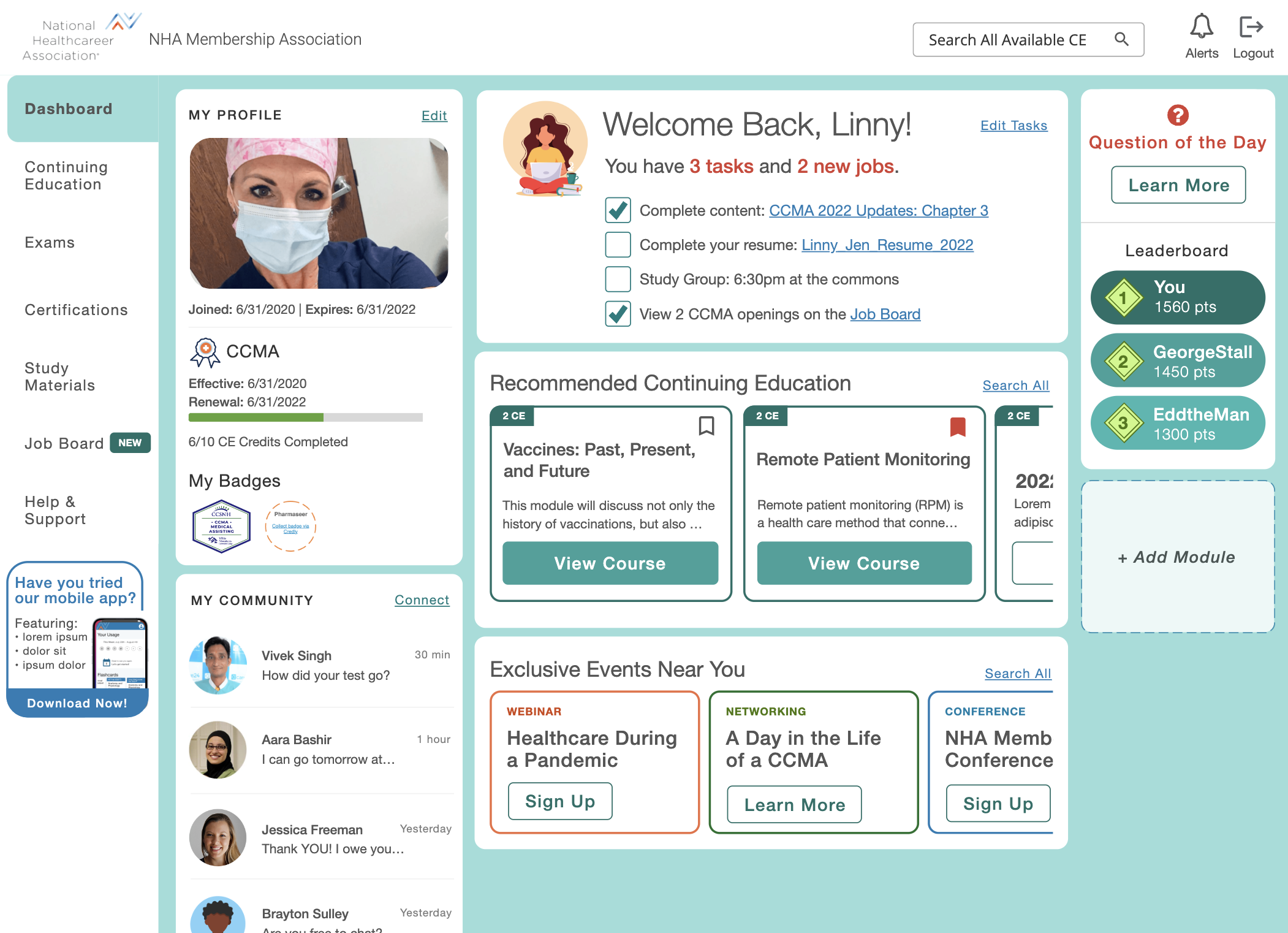
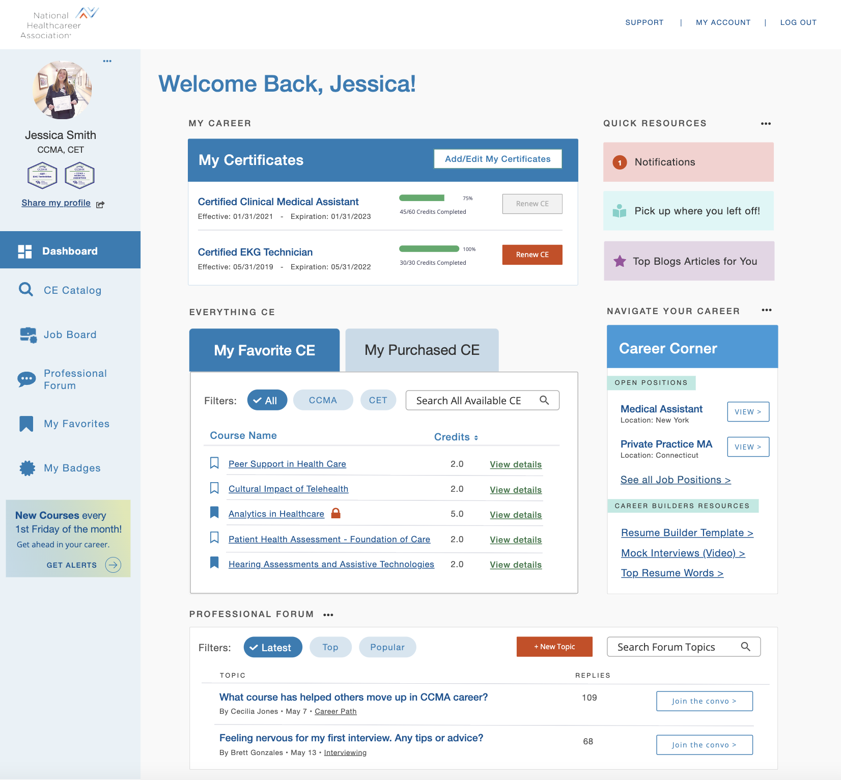
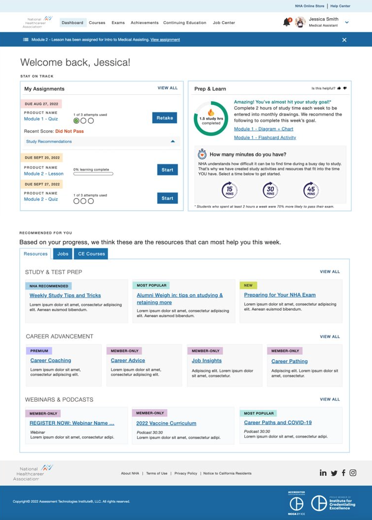
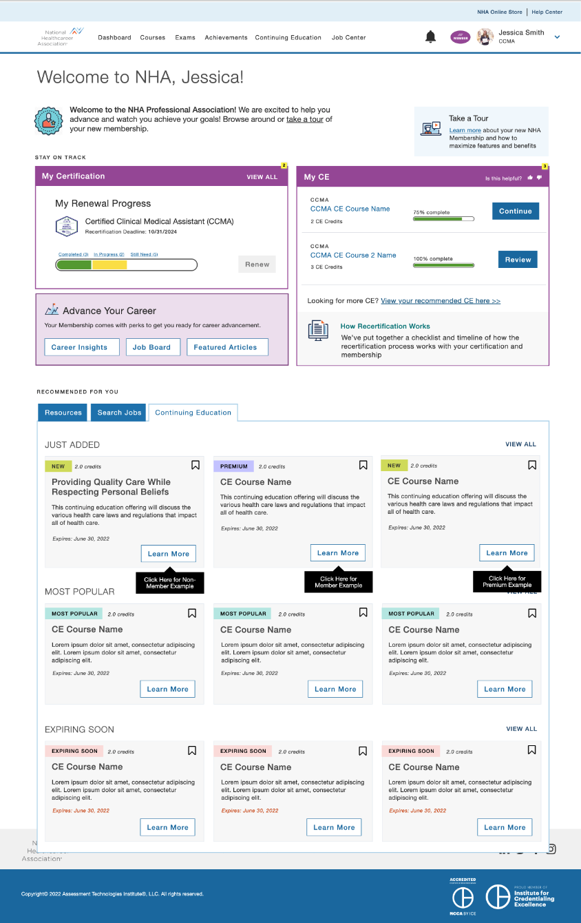
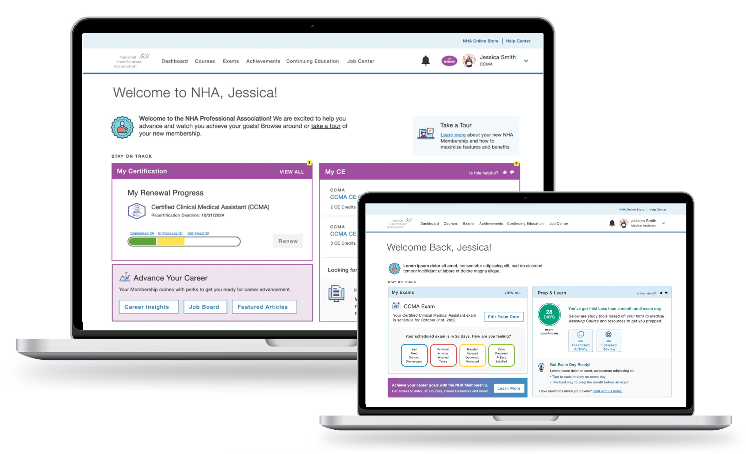
NHA dashboard design for desktop and mobile

Project Overview

Our initial goal for this project was to design a customized logged-in experience that met the following membership needs identified by the business:

  • Centralized hub that provided a customized experience
  • Easy access to career resources and CE courses
  • A sense of community
  • Affordable recertification fees and career resources

Although the product team did a great job understanding the current market, competition and interest with NHA alumni, we quickly identified many gaps as it applied to the holistic user journey across platforms, membership conversion and pricing strategy. We also knew user validation and concept testing would be an essential component of this project.

My Role

I was brought in to lead the overall design direction and strategy. My role also included detailed design and visual design in partnership with another designer. However, over the course of the first twelve weeks, with so many moving parts, my initial role quickly evolved into also managing the execution and delivery of our work along with overseeing a small team of designers.

One of the areas I was most proud of with this project, was my ability to foster a culture of collaboration between a brand-new product team, forming a strong, trusting partnership that lasted well beyond the end of the project.

My Contributions

Competitive Landscape Analysis

​User Journeys

​Personas

Design Workshops​

Behavioral Survey

Unmoderated User Testing

Moderated Testing

Concept Testing

Detailed Design

Visual Design

Implementation Support

Understanding Our Users

While it was important to provide a good user experience and fresh, modern visual design, none of this would matter if we weren’t able to convert users to an NHA member. Our team spent the next twelve weeks understanding the following:

Three mountains with a flag

Competitive Landscape

Gaining insight into professional memberships and pricing models offered by our competitors.

Two users

Users

Identifying our users, their behaviors, goals, tasks and challenges.

Profile with Gear

User's Mental Model

Exploring ways to boost user engagement, conversion strategies, and aligning pricing structures with user mental models.

Money conversion

Conversion Strategies

Mapping out various platforms users would navigate and pinpointing the best touch points for conversion.

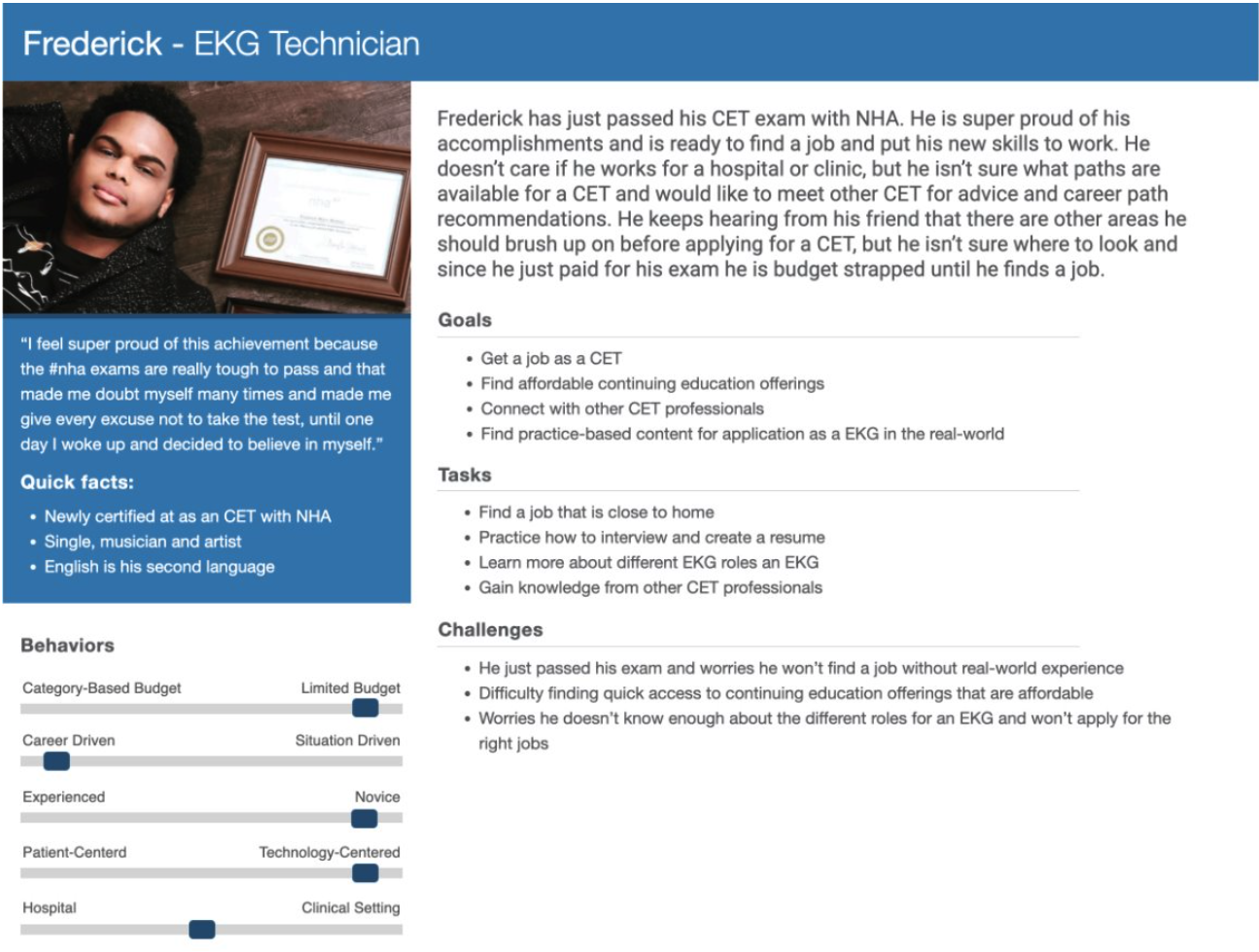
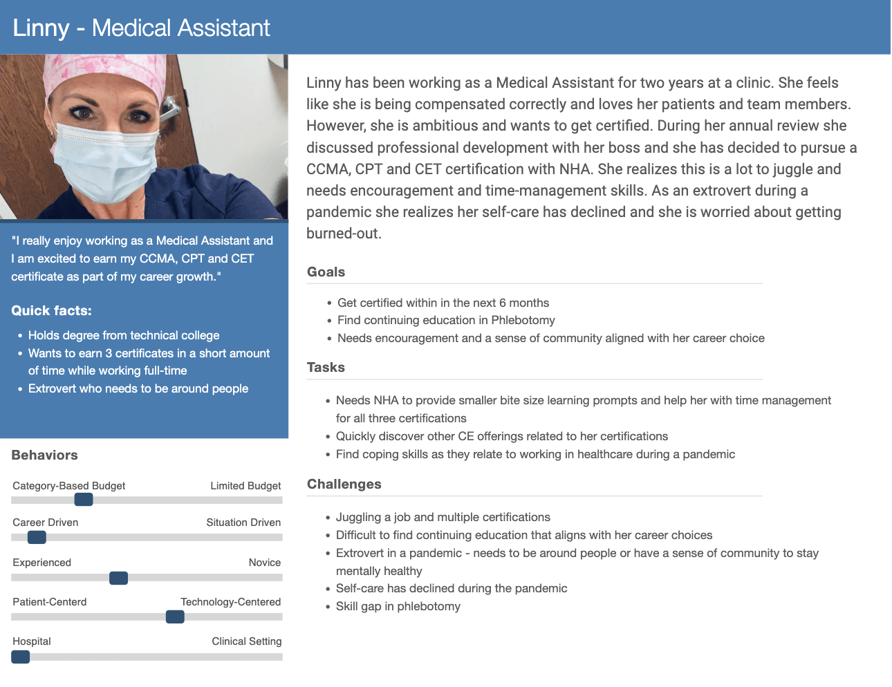
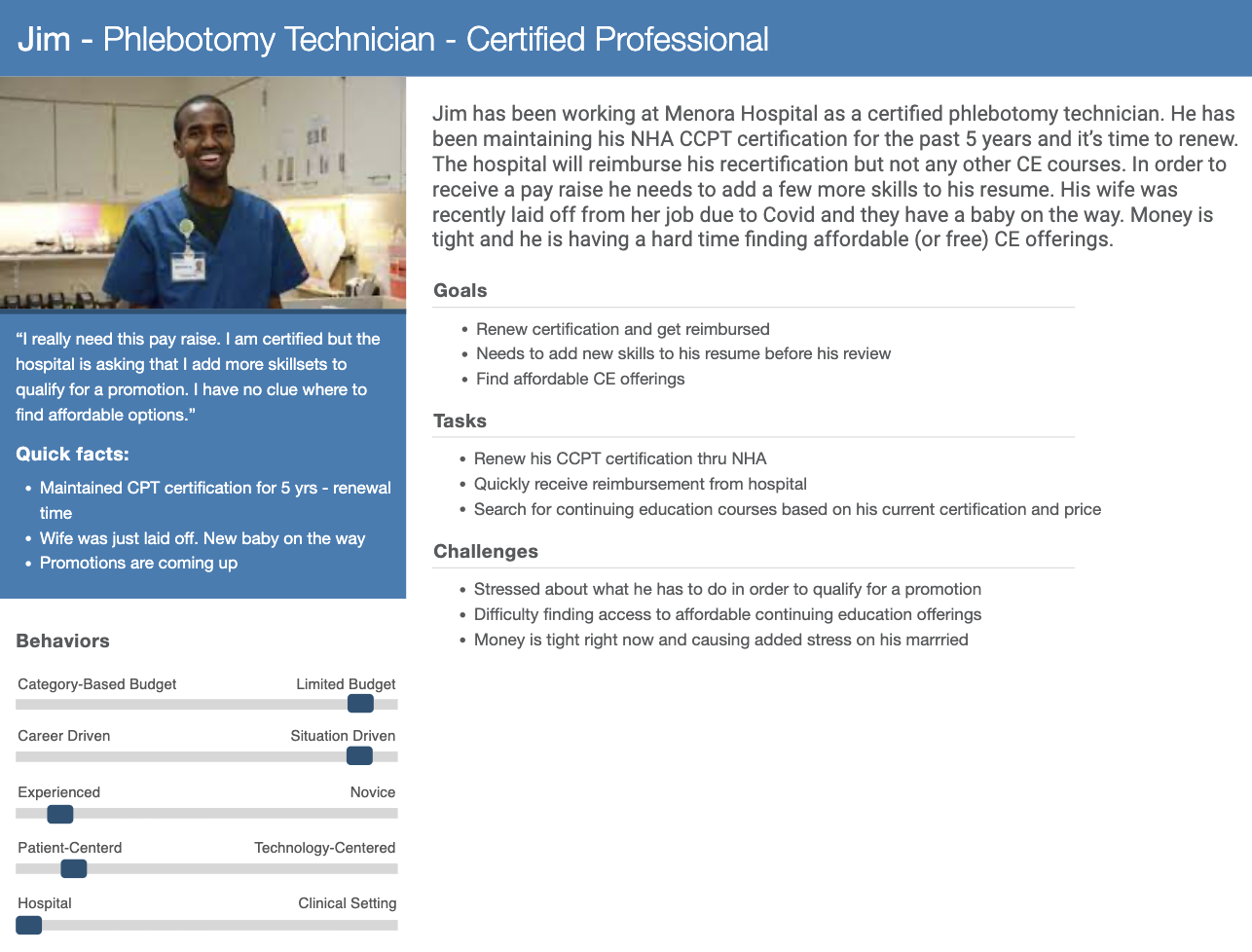
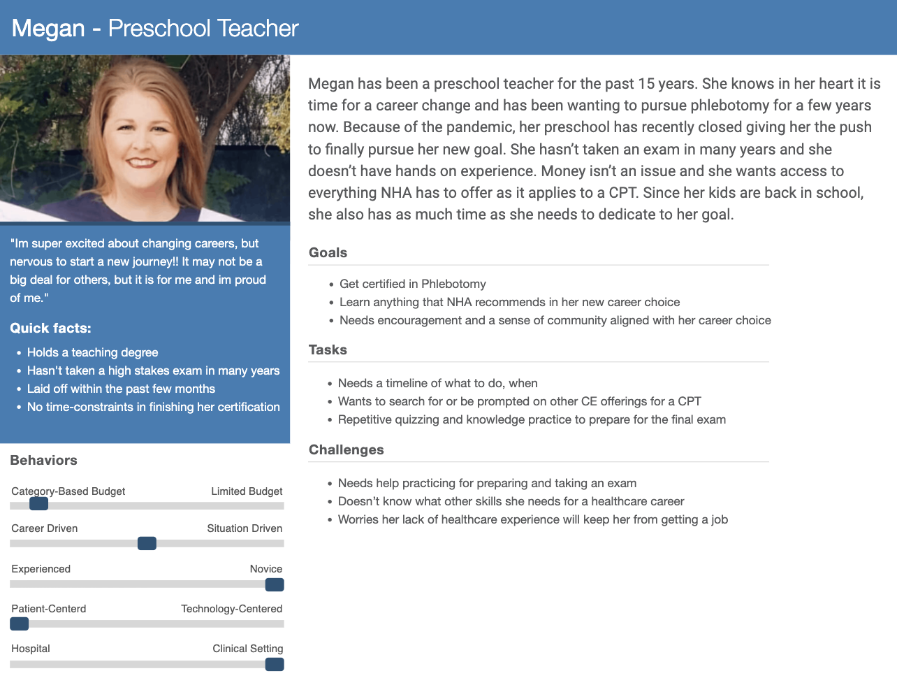
User Persona

The marketing personas we received lacked a comprehensive understanding of the user’s behaviors, goals, and tasks. These details were the building blocks for outlining journey maps and identifying conversion touch points. Our personas were inspired by real NHA users, finding them on social media. Checking out real success stories and scrolling through actual photos established a profound connection with them and fueled our drive for the success of the project.

Our final personas were based on two user types; certified and non-certified, with sub-flavors of each. While identifying attributes for each persona, we learned that the user’s goals and tasks were directly related to life changes (typically money-related) such as being laid off, changing careers, or needing to get certified to be eligible for a promotion.

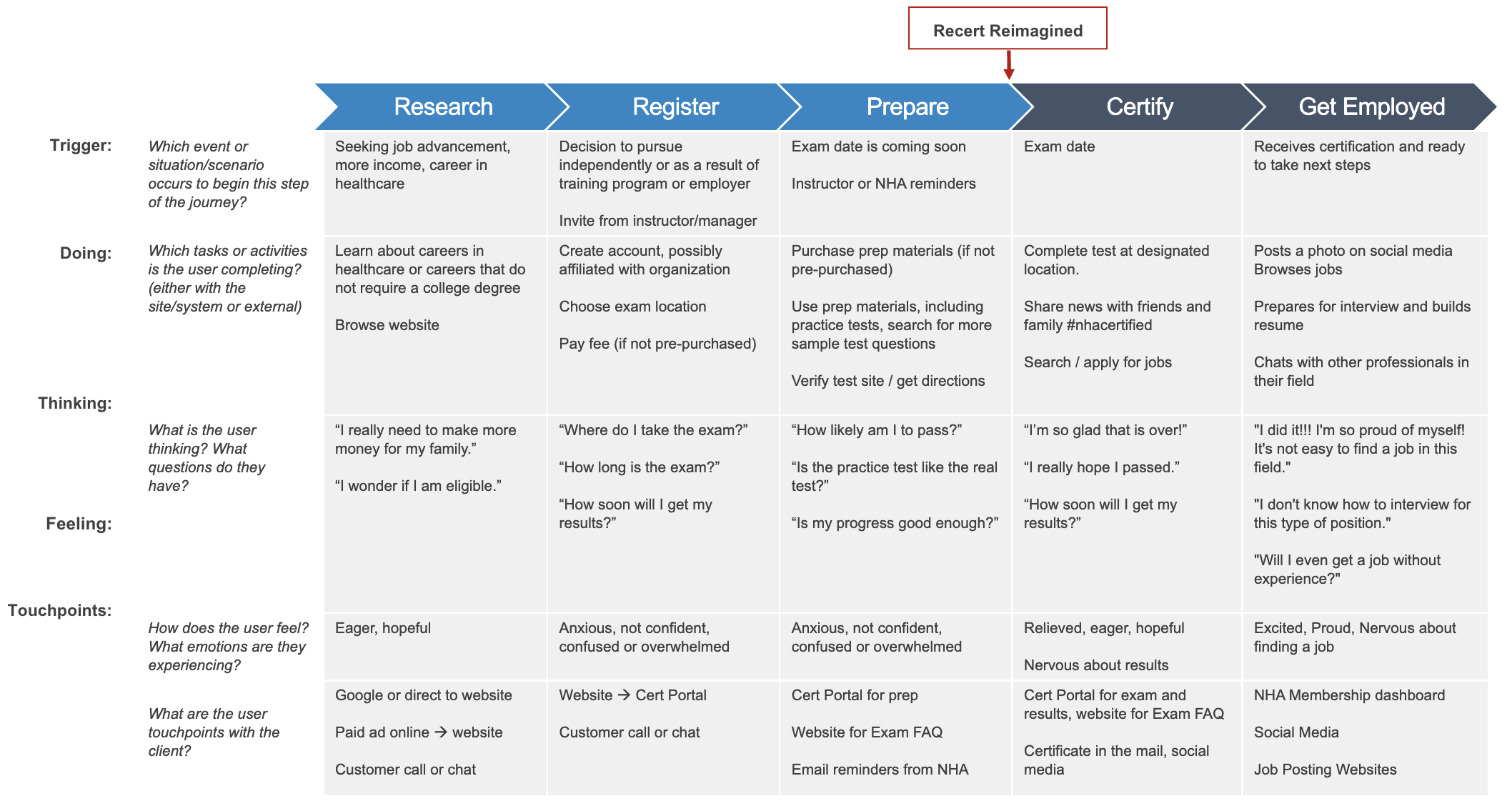
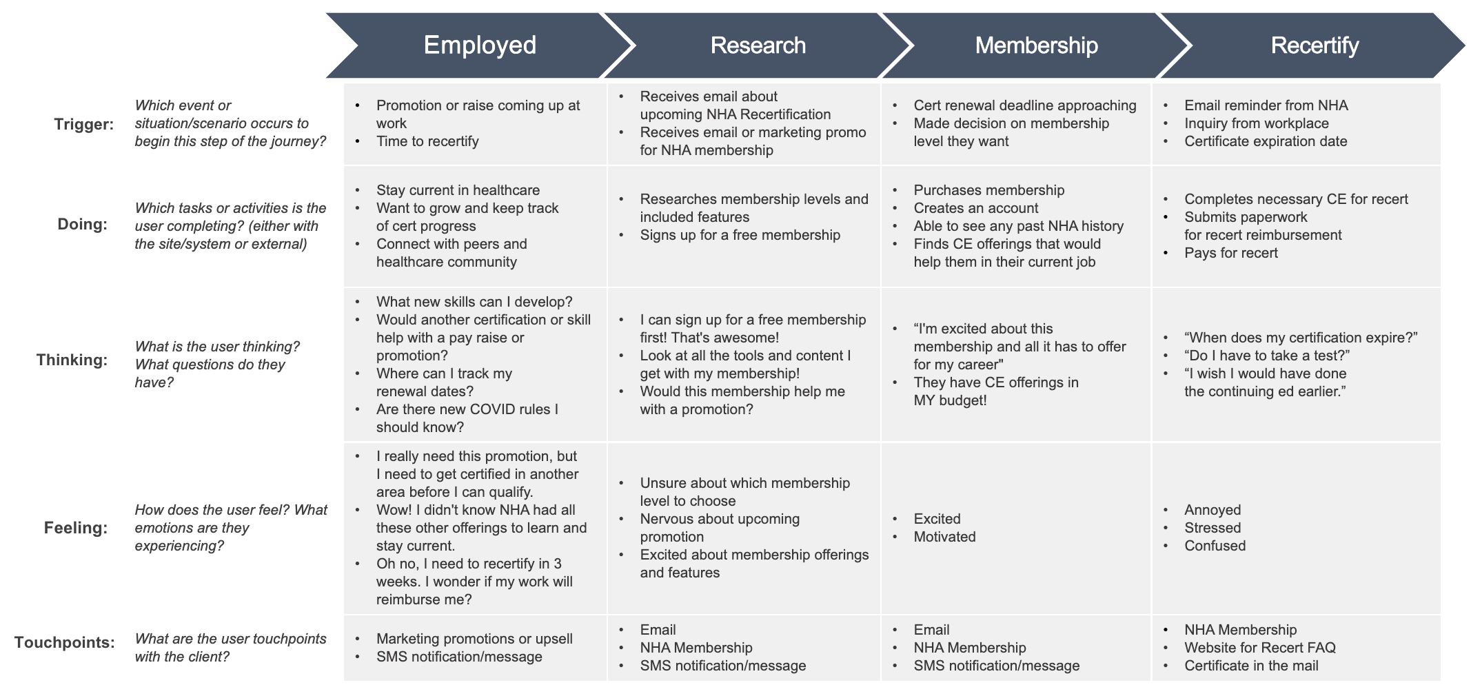
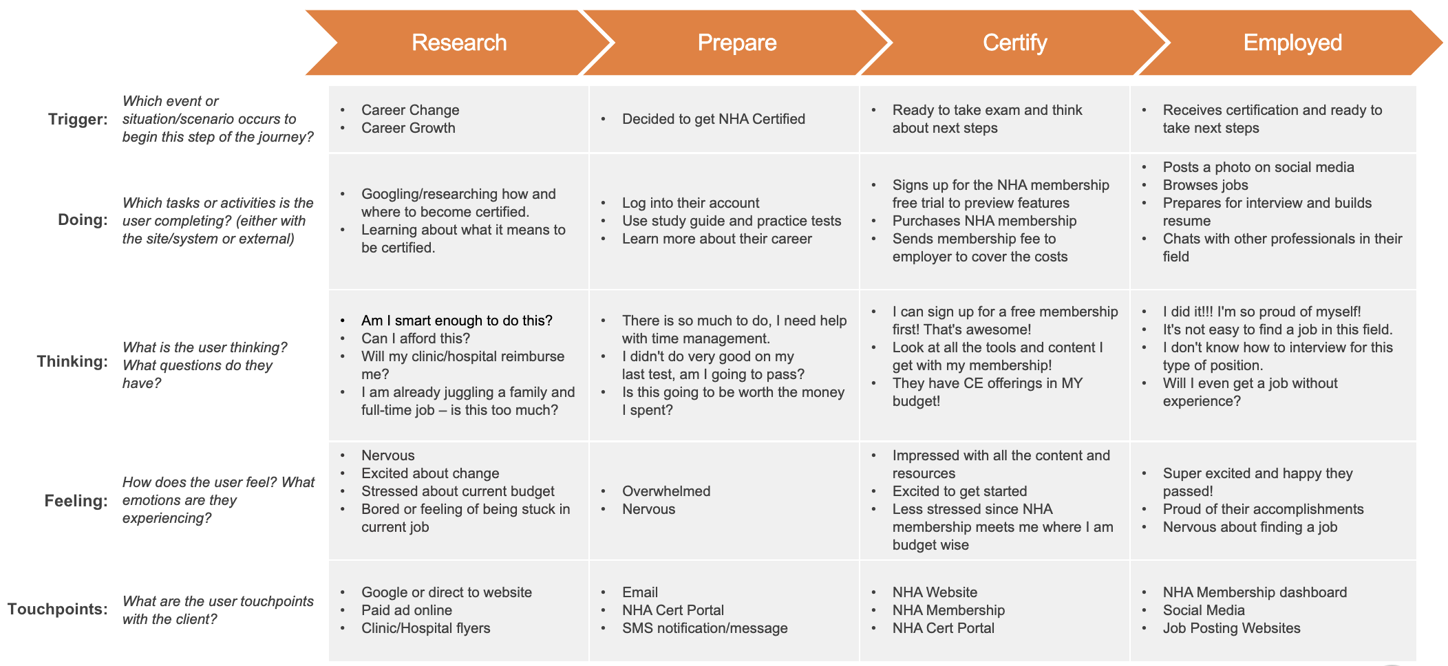
User Journey

A major factor in the project’s success was conversion optimization. Pinpointing the ideal moments for upselling and cross-selling within the user journey helped us identify key areas to prioritize for user feedback and concept testing.

User Flow Diagram

Due to the involvement of numerous teams and various platform touch points throughout this project, we offered different methods for presenting similar data. Presenting the user journey as a series of user tasks helped our technical partners grasp potential implementation approaches and identify which platform teams should be engaged.

Gathering User Feedback

By comprehending our users’ goals and pinpointing our conversion opportunities, we were able to determine the next steps for concept design and user testing. Collaborative and inclusive teamwork was paramount to us and throughout the next 16 weeks, we presented various conversion strategies, refined our concepts, conducted a behavioral survey, and carried out three rounds of unmoderated user testing, followed by one round of moderated testing.

Unmoderated User Testing

Conversion

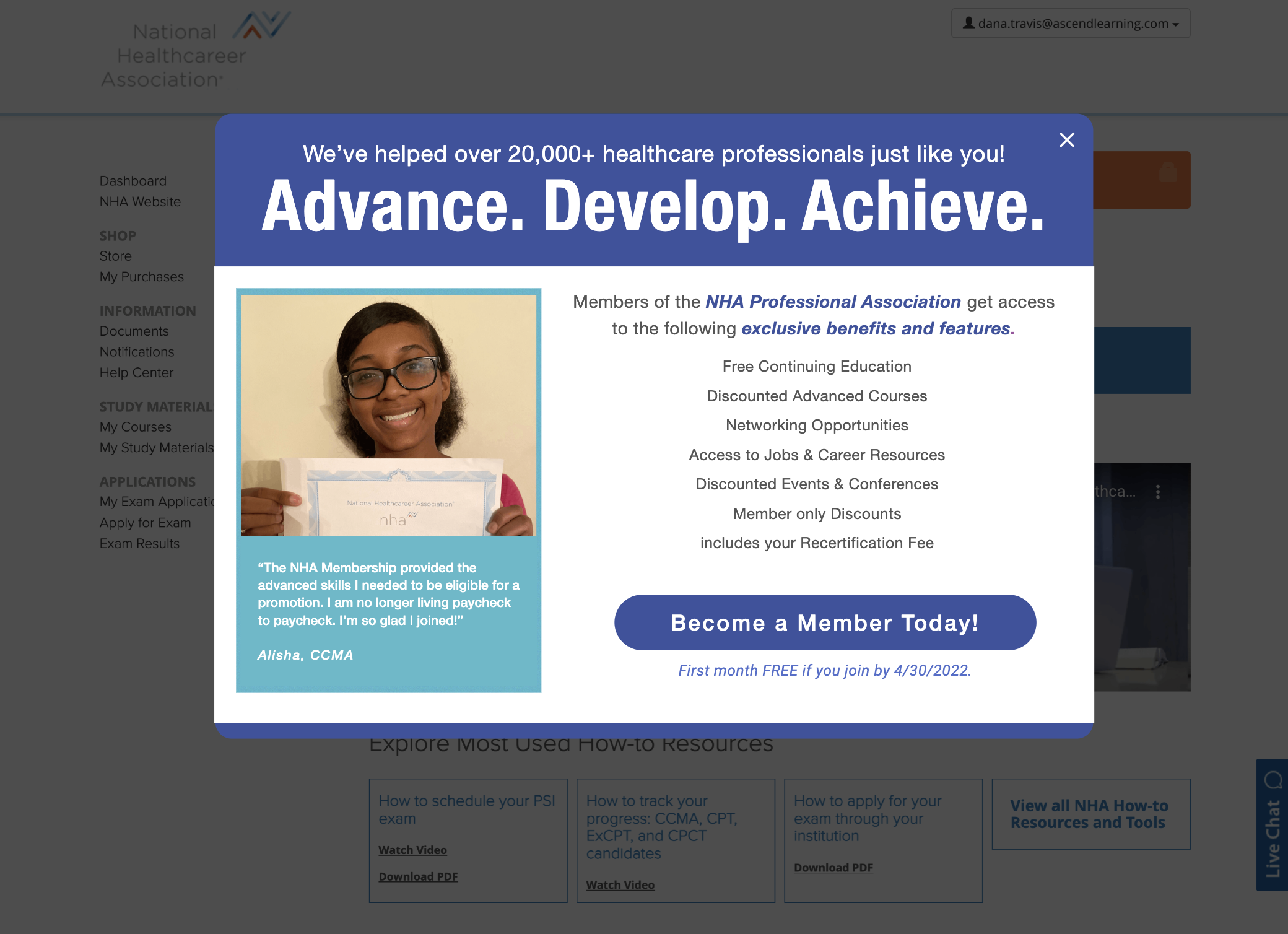
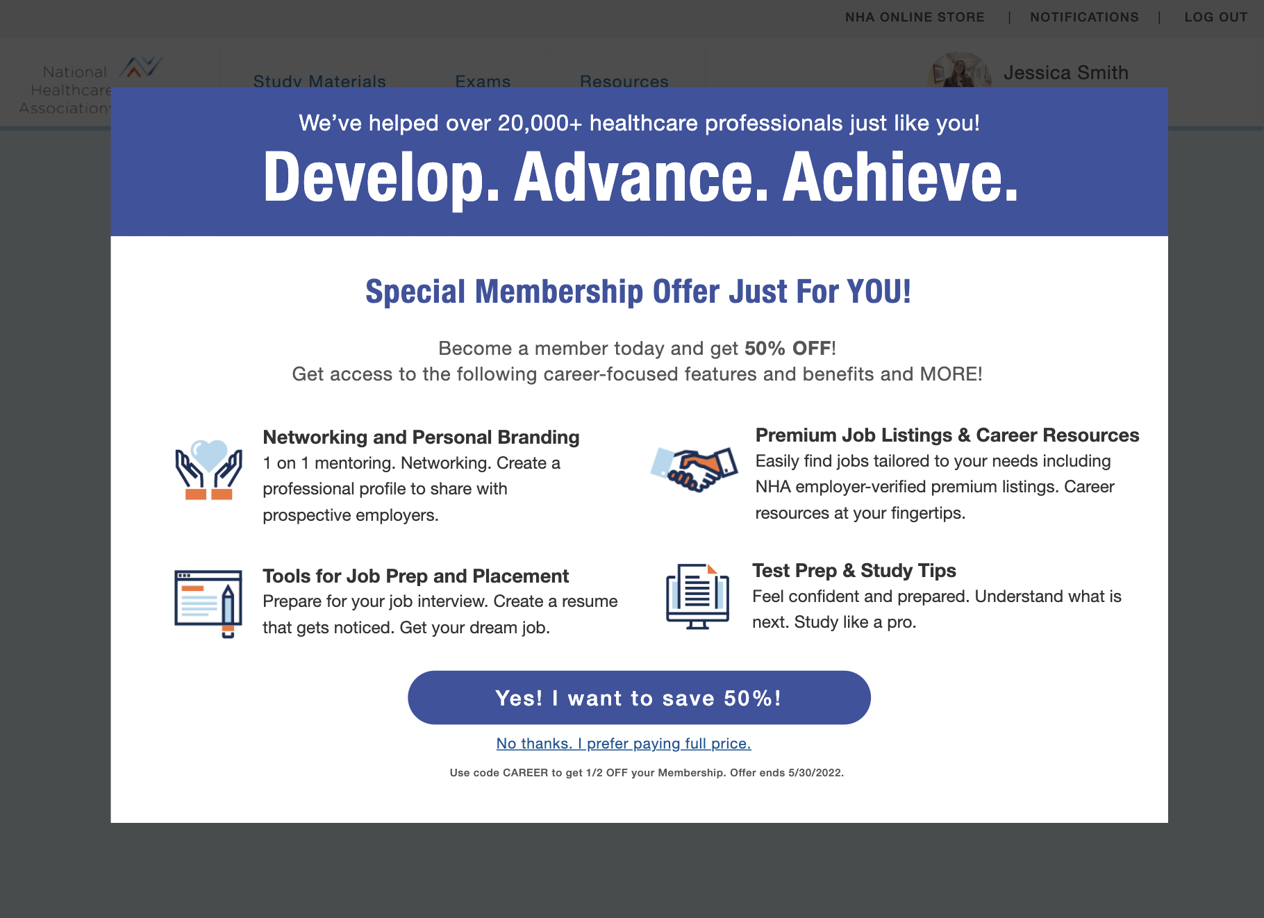
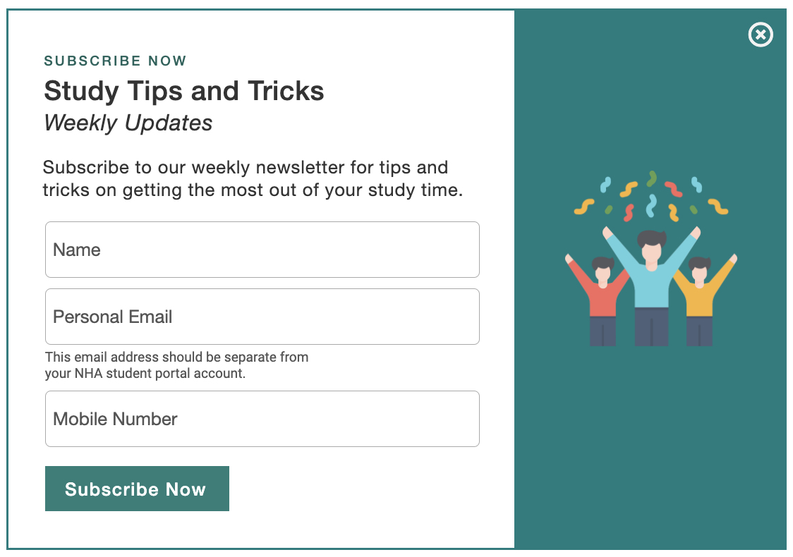
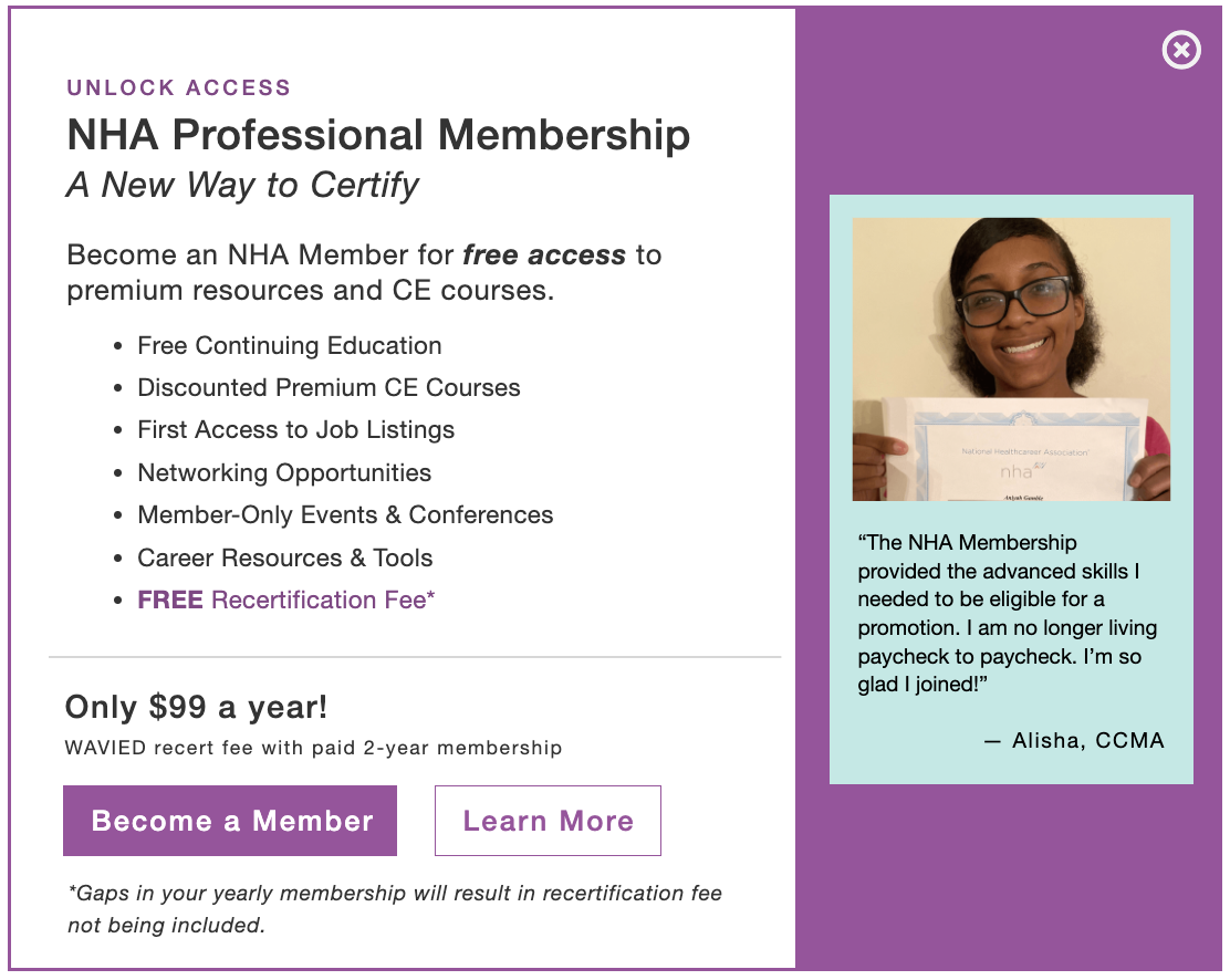
We collected user feedback on conversion by presenting various advertisement concepts. Through experimentation with content, imagery, and placement, we pinpointed successful conversion strategies. Our findings revealed that advertising for the membership should commence immediately upon NHA account creation. Users favored vibrant ads highlighting testimonials, authentic imagery, and membership benefits, advocating for their presence throughout the dashboard layout.

Membership Dashboard & Features

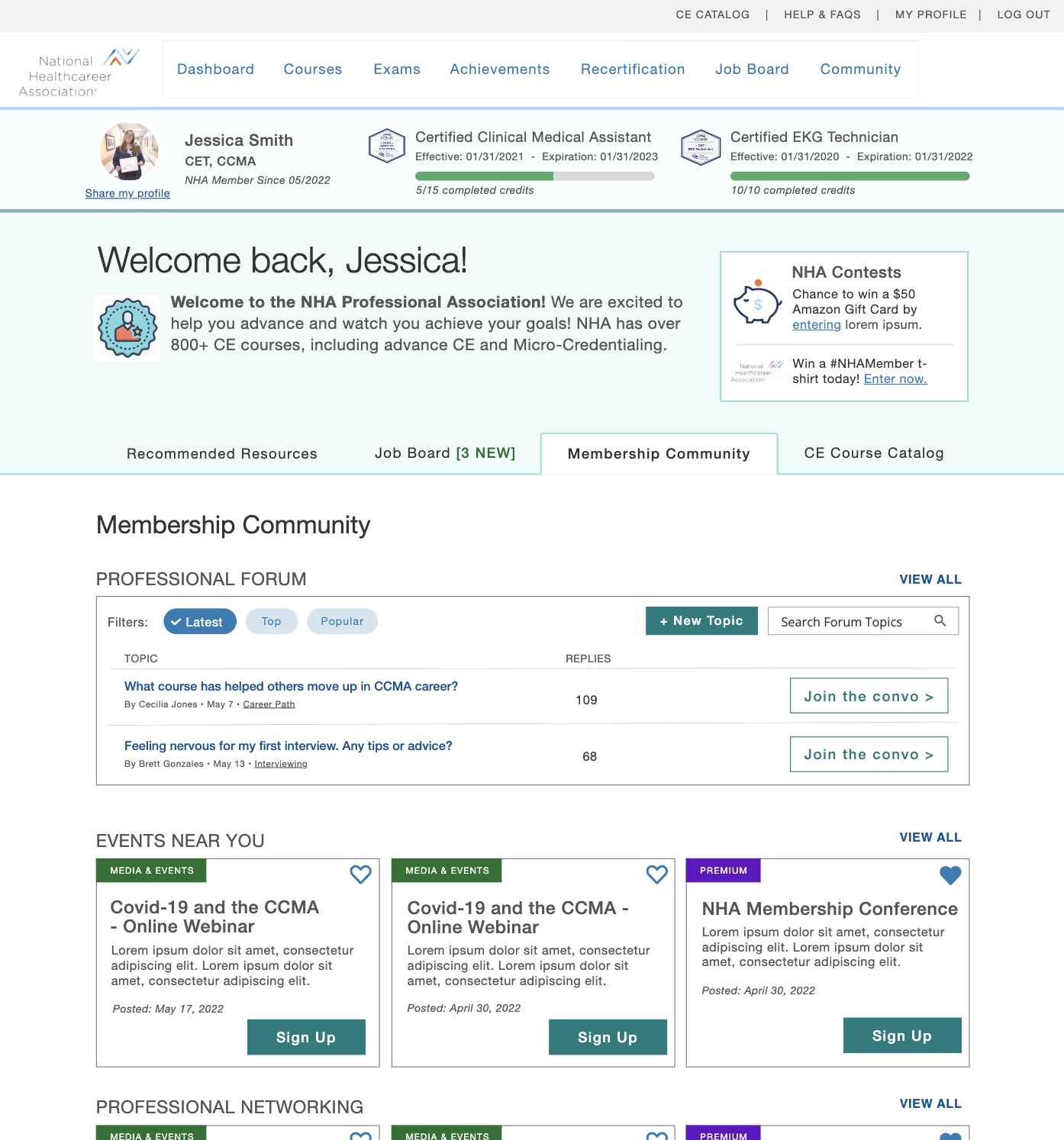
Users loved the new concept designs for the membership dashboard. They appreciated having everything they needed at their fingertips and the features and benefits aligned with their goals. Lots of white space and pops of bold colors made the content easier to digest and less overwhelming.

Membership Details & Pricing Structure

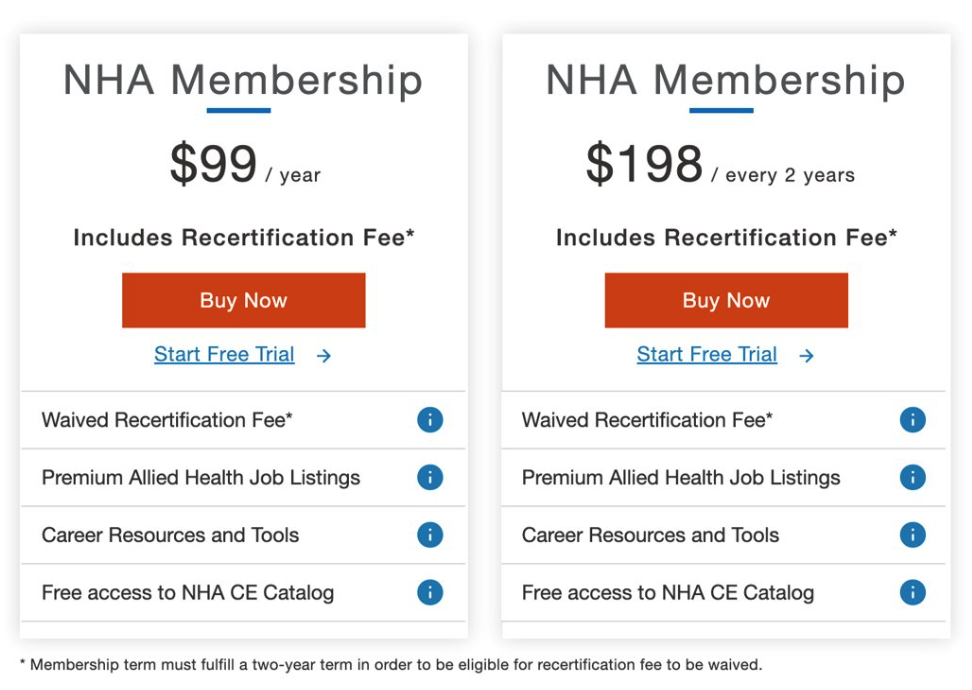
Users wanted to know all the details of what they are paying for, but want it provided in a more concise layout. Users want the option to pay monthly which aligns with what we have already heard, but users may also be interested in yearly payment plans. Easy ways to compare, being up front about what is included and how to pay are all important to users.

Concept 1 - Concise

Concept 2 - Detailed

Moderated User Testing

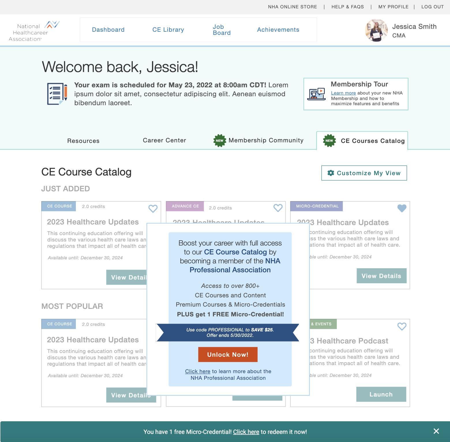
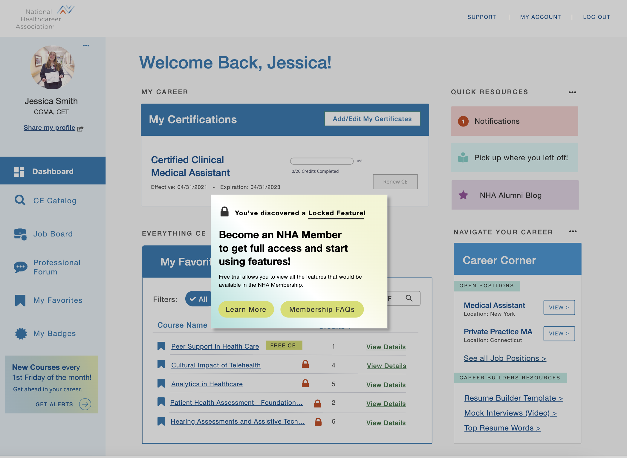
We conducted moderated testing to delve into users’ preferences on membership offerings, benefits and features that supported for their career journey, and validate interest in a trial offer. Additionally, we confirmed user preferences for searching and accessing CE courses.

Concept 1 – Membership Preview + Discount

Concept 2 – Membership Free Trial + Locked Features

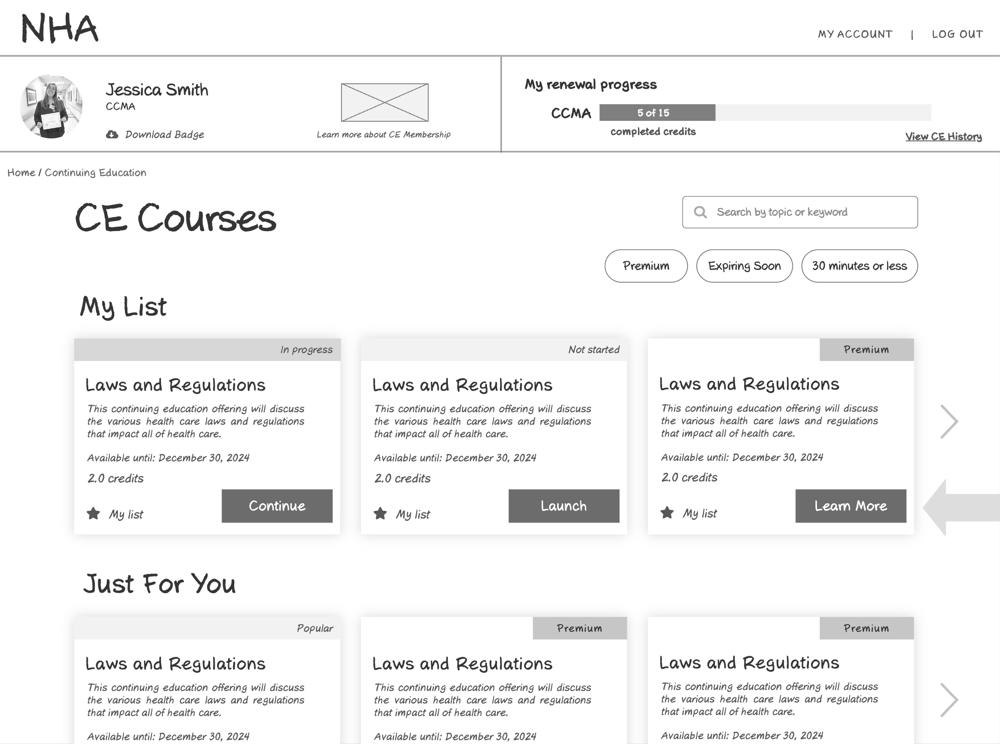
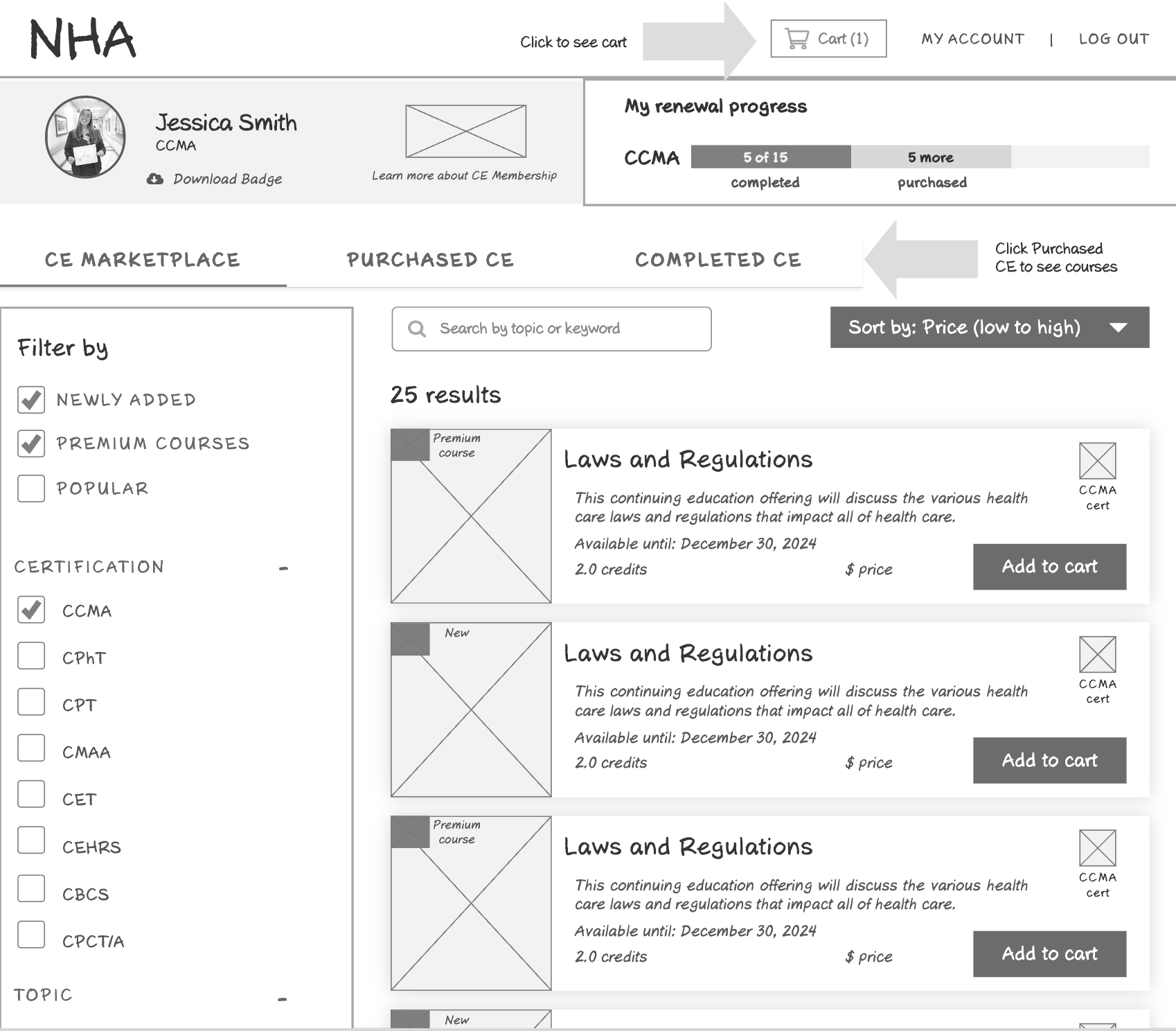
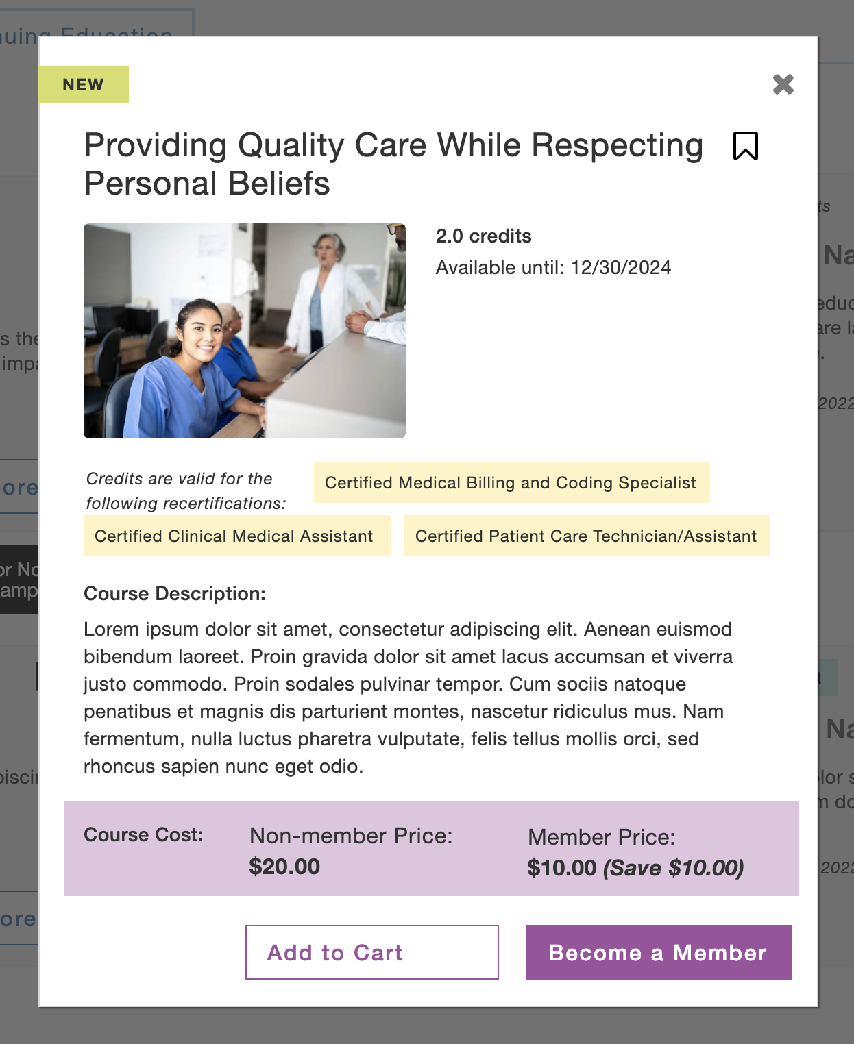
Concept 3 – CE Catalog

Final Designs

The final designs were shaped by five guiding principles that emerged from our extensive process of discovery, research, and user testing.

  1. Predictive and prescriptive nudges based on data analytics and user needs
  2. Guidance, encouragement and recommendations based on user tasks and where they are in their NHA journey
  3. Integrated, marketing owned upsell & cross-selling during critical conversion touch points
  4. Engagement and value-proposition of membership by providing sneak peaks of features outlined as important during user testing.
  5. Clean and modern visual design that supports user experience and marketing needs

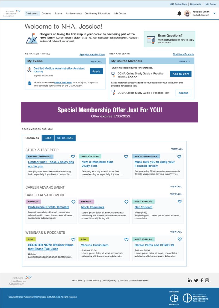
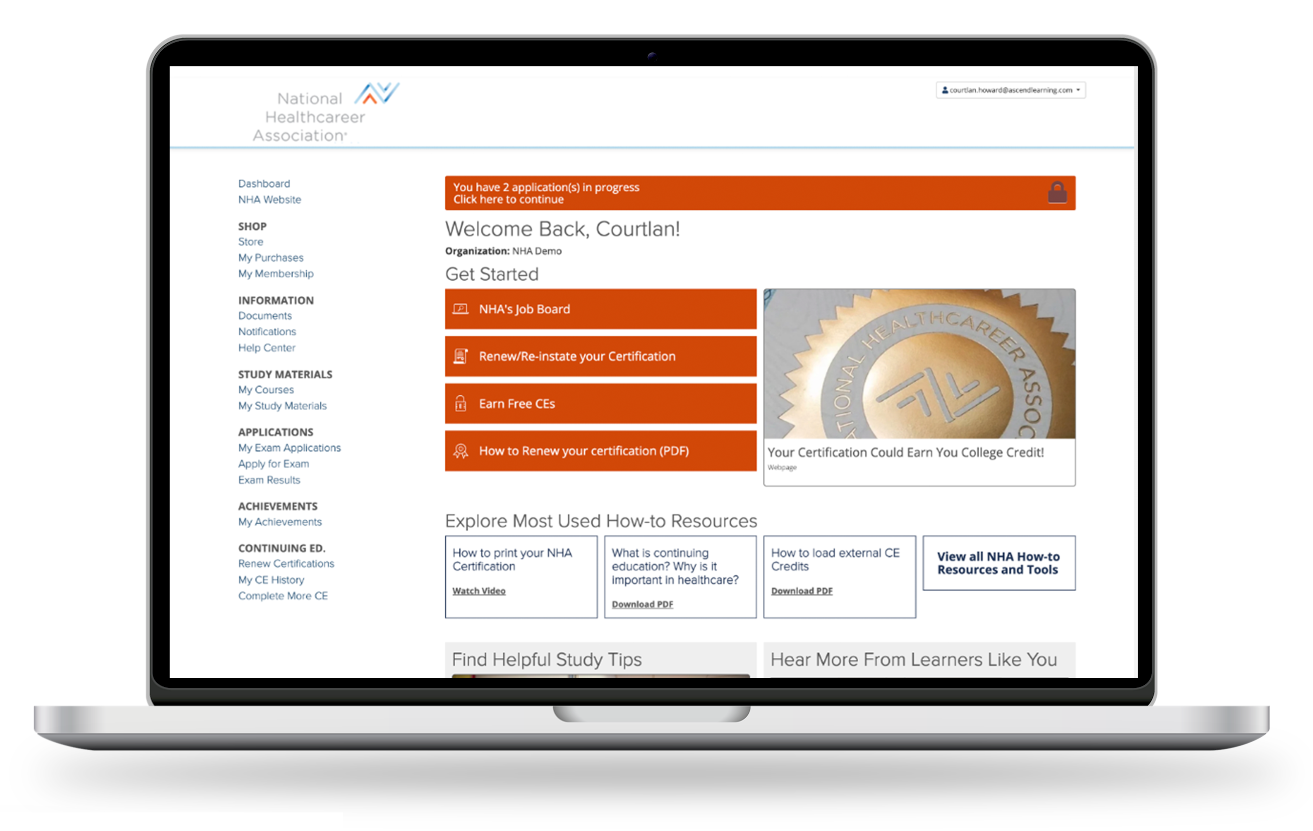
<< Old Design

New Design >>

Project Insights